NATIONAL GRID · ONGOING · ENTERPRISE PLATFORM
National Grid
A two-week project. Now the whole front end.
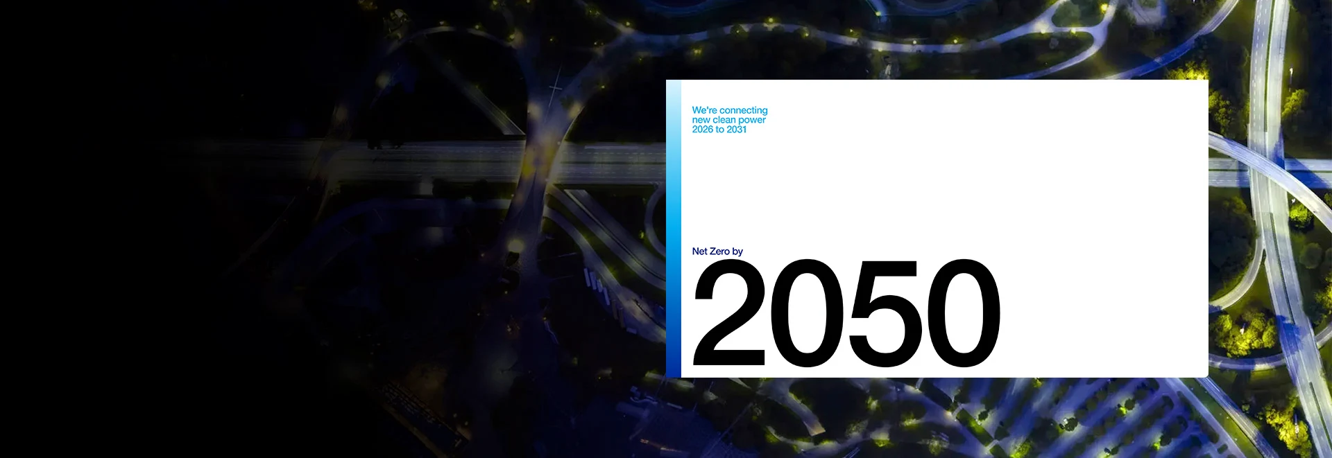
An animated launch page for a twenty-five year infrastructure plan, and most of the interactive front end of the site it lives on. Built alongside compliance review, an internal development team, and a stakeholder list to match.
// 01 · THE SITUATION
They had a grid to run.
In December 2024, National Grid was publishing their twenty-five year plan for the electricity network, and it needed a launch page worth the document. Heavily designed, heavily animated, highly visible, on a date that wasn't moving.
There's a version of that where the work gets absorbed internally and a team spends six weeks on animation libraries. It costs more than it looks like it costs, because the real price is whatever those people would otherwise have been doing. For a company whose job is keeping the power on across Britain, New York and Massachusetts, that's an expensive way to save money.
That's where we came in, with two weeks. The usual route from an approved design to a live page is a delivery cycle counted in quarters: half a dozen developers, a delivery manager, a scrum cadence, review slotted between sprints. A sensible structure for work that runs three months, and not one that gets faster when the deadline gets shorter. National Grid made the one decision that made two weeks possible instead. Rather than push the page through the platform that runs their site, they let us build it on its own and install it whole.
A hundred and four commits later it launched, on the date, with nothing cut from the design to get there. Nearly two years on it's still live and still doing the job it was built for.
That one-off became a partnership. Everything since has been the opposite problem, and the harder one: building things just as ambitious inside the platform rather than around it.
// 02 · WHAT WE BUILT
Millions of customers. Each one wants one thing.
A utility website serves people whose only shared characteristic is that they get a bill. Two countries, three regions, homes and businesses, gas and electric. For any one of them, almost everything on the site is somebody else's information. Every project below is a version of the same job: getting one person to the one thing that's theirs.
Nothing had to be watered down to fit the CMS.
In July 2025 they brought us back for rebuilt homepages, one for each region they serve, working alongside their internal team and another vendor.
Our part was several of the most visible sections on those pages. The animation that shipped is the animation in the file that was approved. The layout that shipped is the layout that was signed off. Nothing was renegotiated downward on its way into the CMS, which is the usual outcome and the one everybody involved has quietly learned to expect.
Those sections went live on all three homepages and have since been picked up and reused elsewhere on the site by people who weren't in the original conversation. Components only get reused if they were built to be handed over rather than built to be finished.
Most of this website isn't for you.
National Grid serves New York, Massachusetts and the UK. New York alone splits again into Long Island, New York City and Upstate. And a household on gas has almost nothing in common with a business on electric.
Put all of that in one menu and every visitor reads past a dozen things that don't apply to them to reach the one that does. A woman in Buffalo trying to work out a gas bill should not be picking her way around Massachusetts business rates to get there.
So she isn't. She tells the site once where she is and what kind of customer she is. Once, not once a visit: it remembers, across pages and across visits. From then on the menu is hers. Her rates. Her programs. Her outage number. Everything else is still on the site and none of it is in her way.
Filters that already know who you are.
The news hub carries everything National Grid publishes, across three regions and every topic they cover. Any given visitor wants a small part of it.
So the page filters as you go, without reloading, and it opens already narrowed to what applies to you. Arrive from Massachusetts and you're looking at Massachusetts news, on the first screen, without asking. Pick a topic and the list adjusts as you pick it.
After the news hub launched, services and rebates came along: the same idea aimed at a different question, a page that surfaces the programs and discounts relevant to whoever is reading it. The news hub had been built well enough that most of the engineering came straight across, so the second page cost a fraction of the first. It goes one step further and reads the customer type a visitor set in the menu, so a residential gas customer arrives with those options already selected.
// 03 · THE HARD PART
Working inside somebody else's system.
The site runs on a closed platform. Editors compose pages in a visual canvas, that canvas is compiled by a service we don't operate, and templates come back. Dozens of people across three regions change something on this site every week, and the platform exists so they can do that without breaking anything. It works. That's what it's for.
The cost is that the tools we'd normally reach for aren't available. The markup underneath is generated rather than written, and it regenerates whenever somebody saves. Behavior we add has to survive being rebuilt underneath it. And every requirement that arrives from a stakeholder has to be reconciled with what the system will actually permit, which is a different job from building it.
So the work isn't making the thing. It's finding the route the platform allows, then making sure that route holds. Twice, the route turned out to be somewhere we weren't expecting.
The filter that wouldn't let go.
The requirement was simple. We already know a visitor's region from a cookie, so the news hub should open already filtered to it. The obvious route, reading the cookie and setting the form in the browser, forced the form to resubmit, which meant a visible redraw or a full page refresh on every arrival, and the platform offered no way around it. So we moved the problem upstream: the CDN reads the cookie and appends the region to the URL before the request ever reaches the site, and the page arrives filtered exactly as if the visitor had chosen it.
Then the form wouldn't let go. The arriving query was baked into the form's own endpoint, so a visitor could uncheck their region, filter again, and watch it reselect itself. We stripped the parameters from the address bar on load and rewrote the form's target so a choice, once changed, stayed changed. Unglamorous, and invisible, which is the point. The visitor sees a page that already knows their region and lets go the moment they want something else.
On a platform, the thing you're permitted to edit is frequently not the thing that's wrong. The fix for this one lived in the CDN and in the guts of a generated form, and nowhere anyone would have thought to look first.
// 05 · THE STACK
Why these choices.
GSAP for the launch page. Scroll-linked timelines, text that splits and animates by word and character, and easing that behaves like a physical object, at a fidelity that holds up on a page representing a twenty-five year plan, on a fourteen-day schedule.
The menu runs on a class-based JavaScript system written for a DOM we don't fully control. Three coordinated classes: an orchestrator, a desktop implementation, and a mobile one, because hover flyouts on a laptop and an accordion with search on a phone are different interaction models rather than one model behind a media query. All of it built to keep working when the platform regenerates the markup underneath it.
The menus live in Site Studio's menu template hierarchy, extended where it mattered. Menu Item Extras gives editors designated Spotlight slots inside the dropdowns, where the template loads preset components they can customize per menu. Navigation stays navigation, and the promotional space inside it stays editor-owned.
Regional and segment logic is configuration, not code. Adding a region is an afternoon for their team, not a release for ours.
Cloudflare handles what has to happen before the application does. Some things can only be decided at request time, before Drupal gets a say. Treating the CDN as a place logic can live, rather than as a cache in front of the real system, was the difference between one requirement being possible and impossible.
// NEXT CASE STUDY
Ruska Roma// START HERE
TELL US WHAT
YOU'RE BUILDING.
Twenty minutes with a senior engineer, and you'll leave with how we'd build it, roughly what it takes, and what we'd worry about first. We read every message ourselves and reply within one business day.
A rough idea is enough to start.
That's in front of us now.
You'll hear back within one business day, from an engineer rather than a form letter. Nothing else needed on your end.
Or just email us at hello@queencity.io